Monday, August 22, 2011
Assignment 2: Self Critique
Comments
I feel that my animation was successful in a way that it shows exactly my intention of my original story for this red box scenario.
I took some time to add in lights and use the camera, which is not a requirement of the assignment, but I thought it would improve the animation. While the final lighting and camera setup is not the best in my opinion, I feel that the spotlight shining on the robot and the boxes is sufficient to bring the focus on those objects, since there's really nothing interesting in the surrounding.
However, I feel that the lights could be better in terms of providing more variety of colors (instead of just a plain white spotlight).
The camera is also positioned at certain position to scope the focus of the animation even further. For example, the later part of the animation had the camera focusing mainly on the red box and the robot. The green boxes are not our main concern so it is partially shown on the screen, if not completely hidden at all. The shaking effect of the camera was an accident discovery when I meddle with the camera. Since the red box is supposed to be heavy, why not show that by shaking the camera when there's a big drop made by the red box?
However, I feel that I could have further utilized the camera, since for the front part of the animation (the part where the green boxes are moved), the animation of the robot moving the green boxes are (honestly) a bit boring, and the camera sitting on the same spot for that period didn't really help bring up the interest.
I think that the last animation where the red box drops off from the conveyor belt can be improved, because right now it doesn't look like it is really being influenced by gravity. Also, I think that the robot could have have another reaction when the box dropped, but I did not have any good idea in terms of what reaction the robot should express when it happens, so no reaction for the robot was incorporated into the last segment.
Principles
The animation uses ease-in-ease-out for the robot's movement. However, I felt that I should have made that ease-in-ease-out movement more obvious by tweaking the curves in the graph editor, so that it is more curvy, which makes the ease-in-ease-out more obvious.
When the robot is trying to push the box, it uses the principle of anticipation, as the robot moves to its preparation position before it gives a big hit on the box.
The animation also uses the principle of timing. The robot gets increasing impatient with the red box as its encounter with the red box gets more and more unpleasant, and therefore is more determined to get rid of the red box as fast as possible, either by normally moving it, or by pushing it away. Its impatient and great desire to get rid of it as fast as possible is reflected by the fact that the robots acts and reacts more quickly as the time goes by for the interaction with the red box.
The secondary action is also displayed in this animation. The robot jerks a little as it comes to a stop. The red box also bounces on the conveyor belt as it is being dropped. The camera shaking as the red box drops is also a secondary action.
Finally, the camera's change in focus during different periods is the usage of the principle of staging, whereby things that are not in our main focus are hidden away from the audience as much as possible by moving the camera away.
Sunday, August 21, 2011
Assignment 2: Storyboard

(click to see enlarged picture)
The BoMo will move 2 green boxes as per normal, by lifting it up from the conveyor belt, and then rotating and lowering it at the platform 90 degrees to its right.
After the two green boxes, the conveyor belt will give a box that is red in color. The BoMo will realise this abnormality, and start to inspect the box, to check that he really did see the red box and see whether there was anything special with it.
Thinking that he worried too much, he goes back to normal and starts to lift the box. However, half way during lifting, the box will drop off the magnet. The BoMo did the lifting of the red box twice and in both times, the dropping off always occur without fail.
Fustrated with the red box, the BoMo decided that the red box is an invalid box, and tries to push the box away from the conveyor belt. It tries very hard to do it but because it is extremely heavy, the robot only manages to move it to the edge of the conveyor belt. After trying very hard to push the box away, the BoMo feels tired, and tries to catch its breath.
In the end, the BoMo effort's paid off, when the red box drops off from the conveyor belt by itself due to gravity influence.
Assignment 2: Character
Name: BoMo (Box Mover)
Thoughts:
BoMo: All in the day's work! Time to start moving boxes again!
(moves box 1)
BoMo: Now for the next box...
(moves box 2)
BoMo: Now for the next box...
(saw box 3 that turned to red)
BoMo: ...wait...
(looks and moves its head around the red box)
BoMo: ...why is this box red in colour? Am I seeing something right?
(retracts back)
BoMo: Oh well, maybe it is supposed to be like that.
(returns back to normal position and start lifting up the box)
BoMo: This box feels a bit...
(drops the box)
BoMo: ... HEAVY! Or rather, it feels extremely heavy!
BoMo: Come on, I can do it, I can move this box over...
(tries to lift the box again, only to drop it again)
BoMo: ARGH!
(tries to push the red box away from the conveyor belt)
BoMo: Go away you stupid box!
(continues to push box away until it is at the edge)
BoMo: (catching its breath)
(stares at the red box)
BoMo: What is inside there? Really...
(box starts to lose balance and drops off the conveyor belt)
BoMo: ...well I guess that's the problem solved!
Tuesday, July 26, 2011
Rigging and Animating the Arm Robot
Forward kinematics - calculate from the root joint (the translation of the root affects the rest of the bones)
Inverse kinematics - calculate from the back (the translation of the last joint affects the rest of the bones)
Process
Basically today's exercise was to learn how to rig the robot. To do so, we use the Joints tool that allows us to create joints.
The joints are created one by one after activating the tool by clicking the different areas where our joints would be, and thus, the bones would be created together with the joints joining the bones together.
Even with the joints created, it is still not completed. First, there is no inverse kinematics, making the last joint feels extremely "disconnected" from the rest of the joints. Second, the joints are not connected to any parts of the body, so even if we move the joints, Maya does not know which part of the model belongs to the joint, and therefore, the model parts would not move together with the joint.
Applying inverse kinematics was just a simple task of selecting the first and last joint and using the IK handle tool. Now with inverse kinematics, the last joint is also able to influences the movement of the rest of the joints.
Next is to actually parent each model parts with the individual joints, this was done using the hierarchy window, but it can also be done in the outliner if needed. By parenting the model parts to the joints, when the joints move, the model parts will move together since it is parented. As this is just a robot, we do not need it to stretch like human skin, so parenting is a good way to rig the robot.
Finally, the parent constraints were created for the crate. What is it for? Basically, it allows us to control when the crates get parented, and which thing to parent to during a certain period. For our arm robot animation, the crate's position will be influenced by the arm control, and the platform. With the parent constraint, I can set it such that before the arm robot sucks the magnet, the parenting effect is disabled, until the magnet touches the crate. When it touches the crate, then the parenting value is set to 1 such that the crate will move together with the magnet. However, upon dropping it at the platform, the parenting value should change such that the magnet no long has any influence (set to 0 for magnet) but the platform now has influence on the crate's position (set to 1 for platform).
Critique 1:
The motion was too unrealistic. Robots usually stop and pause for a while after moving in a direction, but in this animation, the robots immediately switches to the next movement after its previous movement, which is too fast for a robot. There is also no arc in the movement and the motion does not has ease-in-ease-out principle applied.
Critique 2:
The motion was better than the first one. But there is no shaking motion or anything when the machine comes to a stop, to resist the inertia. So, the motion is added in the third video. The final video is below:
Reflection
The rigging exercise was very fun to do as it allows us to animate something that has different parts of the "body", and not just a simple bouncing ball. It shows how Maya provides a system whereby we can create joints that act similar to how human bones and joints works. This will definitely be very useful since we do not have to animate different joints separately and end up getting weird or screwed up positions, as the movement of the other joints are influenced automatically, allowing us to just focus on animating how our robot should behave.
The constraint part of the tutorial is also a life-saver since it means that if we have any changes that we want to make for our robot, we don't have to worry too much for the crate, since the crate is temporary parented to the magnet via the constraint and not animated separately, so little, if not none at all, fix is needed for the crate when we change the magnet's movement.
Thursday, July 21, 2011
Week 13 Exercise 2 Questions
1) Apart from their different sizes, it is obvious from Luxo Jr. that the big lamp is “older” and that the small lamp is “younger”.
How is this communicated by the animation? Give at least THREE examples.
Do NOT say because the small lamp is playing with a ball, or that its name is Luxo Jr. – you should be looking at the animation, how the lamps move and emote (emote means to express emotions).
First, the smaller lamp feels more energetic than the bigger lamp. The smaller lamp tends to leap around more often and moves around the area frequently compared to the big lamp. Younger people will usually be more energetic and likes to move and jump around, compared to the adults or even the elderly.
Secondly, the small lamp also express its disappointment when the smaller ball deflates by lowering its head, while the big lamp, after the small lamp temporary left the camera view, moves in such a way that it gives a sense of relief that the trouble is gone, and is also observing the deflated ball. Therefore, it shows the maturity of the two lamps and obviously the expressions shown by the big lamp and small lamp shows that the small lamp is more immature than the big lamp, and older people shows more maturity than the younger people.
Thirdly, the big lamp shows less interest in the small ball as it tries to move it away from its surrounding whenever the ball rolls in front of it, without any concern of where the ball is heading to. However, the small lamp is playing with the ball, and not getting rid of it, as it is trying to chase the ball after pushing the ball away from it. Therefore again, we can see that the big lamp is much more adult because adults have less interest in things such as the ball, which does little to make it enjoyable for them, while children will be more curious about the ball and try to generate some fun with the ball by moving it around so that they can enjoy themselves.
2) Give an example from Luxo Jr of how timing is used for comic effect. Explain how the timing decisions contribute to the humour.
The timing of the movement, actions and reactions of the lamps makes it looks more lively. Since lamps are robots their movements should be rigid, fixed, and has a constant speed, but because of the different timings and fast motion and slow motion in different periods, it creates humanly personality in the lamps. The possessing of human behaviours and movement due to the timing makes it looks more comical since should lamps really move in real life, the movement timings and all are fixed and constant.
3) When you create a joint chain, these form a hierarchy, with the first joint at the top and the last joint at the bottom. Explain why this is necessary for the joints to work properly.
The first joint influences the rest of the joints below it. Without the hierarchy, if we rotate the first joint, other joints will not move together with it. The hierarchy also describes the relationships of the joints, since not all joints might be belonged to one whole group.
Week 12 Exercise 2 Questions
1) Do you need to be able to draw well to create good 2D animation? Explain your view.
Partly yes. Being able to draw will make your characters and objects looks more realistic. However, animation is also about timing and movement. In other words, you must have both of the elements to make a good 2D animation. Either one is missing, and the animation will turn out bad.
2) Do you need to be able to draw well to create good 3D animation? Explain your view.
Since we are using Maya, drawing would not be really an issue. Storyboarding does not require fantastic drawings, as long as the purpose and intention of the animation is known, then it served its purpose. Otherwise 3D animation would be the same as 2D animation: the model must look good in terms of appearances and movement.
3) What do you think would separate a piece of poor animation from a piece of good animation? In other words, how would you go about deciding if a piece of animation is good or bad?
Sometimes there's no actual guidelines for judging an animation. Depending on the intended style of the animation, it might not always be extremely realistic. As long as it looks good to the style that we are expecting, then it will be good.
Some things like timings however will always be expected in our animation, such as ease-in and ease-out. Good timing naturally contributes to the quality of the animation, however, things such as physics and realism can be varied.
4) In 2D animation, you need to be very aware of timing at a frame by frame level, using timing charts and other techniques - but for 3D animation, this is handled using the graph editor, which is more concerned with manipulating rates of change over time.
Does this affect how you approach your animation work? Explain.
It does not. It still require good timing on a frame-by-frame basis. While Maya helps us draw the arcs and curves, it is not always in the perfect shape that we want, thus we have weighted tangents in the graph editor.
Manipulating the curve still requires the awareness of timing at frame by frame. Sometimes, even though we have our keyframes/poses and our curves/arcs, we still find that the ball might be going way too slow at some areas and too fast at other areas.
5) Give a brief critique of Maya as an animation tool. Don't just say Maya makes animation difficult, or easy, or that you need to learn a lot of stuff to use Maya - explain what Maya does well and not so well in terms of creating animation.
Maya allows easy creation of animation. Maya has frame interporation, allowing frame between keyframes to be generated automatically, and allow us to apply the ease-in-ease-out principle easily by using curves. This means that we do not have to do it frame by frame manually to adjust the object's transformation, which is a tedious job.
However, when dealing with complex animations, Maya tends to be more difficult to use, especially when adjusting the timings. Sometimes the time slider is not sufficient enough, and you have to use the graph editor, and even then, moving the frames through the graph editor is difficult because all the frames right behind what you are currently adjusting have to be moved as well, and also frames for other objects.
Monday, July 18, 2011
3 Bouncing Balls
Left: Heavy Ball
Middle: Ping-pong Ball?
Right: Balloon
The steps were pretty much the same as the bouncing ball. However, this time, we are only concerned about the height of the ball.
Physics
Although things fall at the same speed for the initial fall, the weight of the heavy ball and the ping-pong ball is different, so the heavy ball experiences a greater loss in height than the ping-pong ball when it bounces back. This also means that the heavy ball will stop bouncing first, while the ping-pong ball will take a while longer to stay on air.
The balloon will fall slower however due to air resistance. So it takes a longer time to land. My animation is not perfect, but the balloon will also experience bouncing but at a slower speed.
Process
The process was the same as the bouncing ball, except that the end time has to be constantly changed when we move from one ball to another, as each ball will take different amount of time to finish its animation.
The key-frames were again set on the extremes of the animation (the highest and lowest point that the balls can reach). Because the heavy ball falls faster (or as least it appears to be, since that would contradict what I say earlier), the intervals between the keyframes for the heavy ball is smaller, compared to the ping-pong ball, while the balloon has the largest intervals between keyframes.
Unlike the bouncing ball, I used the time slider to adjust and scale the intervals instead of using the graph editor to scale. It is much more easier to do the scaling in the time slider.
The graph editor is still important though, so that the balls lands smoothly and not stay on the air at the highest point for too long.
Reflection
This exercise allow us to teach us about observing the weight of the bouncing balls. The weight and the air resistance of the bouncing ball will affect how it is pulled by gravity and how it bounces back. I feel that this exercise is pretty useful because it allow us to see the flaws in our work from one ball to another. For example, if the heavy ball and the ping-pong ball stops bouncing at the same time, then we will know that the timing is some kind of wrong.
Thursday, July 7, 2011
Squash and Stretch: The Q&A
1) Why is squash and stretch so useful in animation?
They are useful because they allow us to see the bounciness of the object. Imagine a 2D animation whereby there are two balls of different materials bouncing, without the use of squash and stretch. It would be hard to actually tell (other than inferring from the texture) whether the objects are flexible and bouncy or not.
If both balls lands without squash and stretch, it would look and feel like they are both made of steel. However, add in exaggerated squash and stretch to one of the balls, and now we can see the difference between the flexibility and bounciness of the two balls!
Finally it also gives a sense of volume to an object. An object can have squash and stretch but it retains its original volume.
2) Think of a situation in which extreme squash and stretch could be applied to a character - try to be original.
A character punching another character! The character being punch could had a huge round body so that when he got punched, he does not move immediately, but his body shape gets "squashed" in by the punch. It takes a few milliseconds before the punching force is felt by his body, causing his body to start flying away and his body shape "stretched" out before returning to the original form.
3) Think of an animation example where squash and stretch would NOT be appropriate.
Animating a steel ball bouncing, as given in the example in Q1. A steel ball is not flexible so it should not change shape when it hits the floor. Another possible example would be when books are dropped. Books are not really bouncy so it shouldn't squash and stretch.
4) If squash and stretch doesn't really happen so obviously in real life, why do you think is it so effective in animation?
Squash and stretch helps to create a cartoony feel and makes it feel more lively and interesting. At the same time, it also describes details, such as the bounciness and flexibility of the object, that would be hard to see without squash and stretch.
Wednesday, July 6, 2011
Squash and Stretch Revisited
Process
In this lab, we are basically required to add squash and stretch to our bouncing ball to enhance its bounciness.
However, because this tutorial did a different way of creating the bouncing ball, I have decided to follow the tutorial instead. Those obvious differences between my method and the tutorial's method include:
- Group the ball into itself two times, one for translation and one for rotation. Not sure why this is needed. I found one of the possible reasons inside the Maya F1 help, but couldn't be sure whether they are talking about the same thing:
- Created a deformer before we start the animation process. Obviously this wasn't needed in the previous lab.
- Locking some attributes. Since now we have special groups for a particular group of attributes, we don't want to accidentally change translation values for rotation attributes.
The factor for the deformer was used to change the shape of the form. A positive value will gives a stretched ball (the shape when it bounces off), while a negative value gives a squashed ball (the shape when it hits the ground).
Just like the translate attributes, rotation attributes and etc, the factor attribute for the deformer can be key-framed and given different values for different frames, so that it can be changed throughout the animation.
How big should the values be will depend on how much exaggeration we want. The bigger the (absolute) value, the more deformed and stretched/squashed it is, thus being more exaggerated. Smaller value means that there will be less stretch and squash, which results in less exaggeration but also might be hard to see. You won't use smaller values if the thing is bouncy though.
The graph below shows the change in the factor value for our deformer for both objects that we need to animate: the tennis ball and the beach ball.


And... yet another video of my final animation after all the work done!
Reflection
In my opinion, it is still very difficult to get my squash and stretch correct. Sometimes I switch the values back and forth, from big values, to small values, and back to big. Real-life footage seems to have little use in here since they do not seems to squash and stretch much (either that or the quality of the video footage is too poor to reflect that?) Perhaps I can use cartoons instead as references for animations such as this.
The deformer was very useful because it allows us to change the shape of the ball without needing to use the Scale tool. The reason being that the squash and stretch principle states that objects may change shape, but their volume should remain the same. With the deformer, you can change the shape without screwing up the overall volume. Using the Scale tool is risky and you might end up getting a bigger ball than original.
The Bouncing Ball
So now we have tried making the ball bounce over the fence... now it is time to make our own bouncing ball!
Process
Started fresh in Maya, added a polygon sphere and a flat plane to start with.
The first thing to do was to check that the settings was right. We have to set the frames per second (fps) and playback speed to 24 fps, or it will play extremely fast.
Next up... start setting up the keyframes. Using the ball bouncing animation in Pencil, I was able to set those keyframes at the proper time. I started tackling the extremes/poses on the bottom first...
Then I moved on to putting up the keyframes at the other extremes/poses at the top:

Now when the keyframes are set, the basic animation creation steps are completed. From here onwards it is better to modify the animation values using the graph editor.
The first thing that I notice when I played back the animation was that the ball was bouncing off the ground very unnaturally. This is because it lands on the ground in the curvy manner, which feels like the ball is braking as it approaches the ground, which feels weird. So this problem has to be solved in the graph editor.

Basically, we have to fix the tangents of the points selected above, so that it drops sharply to the floor, as opposed to braking as we land. Using the break tangents to separate the two tangents, and by using the Move tool (Q), I was able to make the curve look just the way I described and wanted:


Now that's done, I moved on to delete a few key frames that are no longer needed. One group of keyframes are the top extremes/poses. Basically, even without them, we can still make it curvy with the bottom points of the curve. For the translate X curve, which I haven't touch it yet, also have some extra points in the middle which was unnecessary, so it gets deleted anyway.


Next was to delete the static channels. Basically those channels are attributes that have a straight line throughout the whole animation, so they are pretty useless and a waste of processing power. So... they will get deleted! The blue and grey lines below are examples of static channels.

Now finally, the last thing that I am left to do is to actually replay the animation over and over again and spot areas that I can tweak and improve on. Although the curve above looks pretty perfect, I saw in my animations that there were still some problems:
- The speed in the X direction is the same throughout the animation. The ball loses kinetic energy over time, so the speed should be slower. Therefore, the red curve was tweaked to illustrate that.
- The height for the one of the top extreme/pose is wrong because it is higher than half the height of the previous one. The removing of the top keyframes meant that the curves' tangent had to be readjusted and therefore this problem popped up. Therefore, the tangents have to be moved to readjust the heights of the curve.
- The high points of the curve are in the middle of the curve... since the ball is slowing down I figured it would be better if the curves were slightly slanted towards the right side to further show the slowing down of the ball.
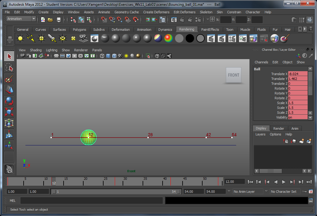
Eventually, I reached to the final version of the animation. This is the motion trail of the ball:
And a video that I created using Window > Playblast that shows the final animation!
Process
Started fresh in Maya, added a polygon sphere and a flat plane to start with.
The first thing to do was to check that the settings was right. We have to set the frames per second (fps) and playback speed to 24 fps, or it will play extremely fast.
Next up... start setting up the keyframes. Using the ball bouncing animation in Pencil, I was able to set those keyframes at the proper time. I started tackling the extremes/poses on the bottom first...
Then I moved on to putting up the keyframes at the other extremes/poses at the top:

Now when the keyframes are set, the basic animation creation steps are completed. From here onwards it is better to modify the animation values using the graph editor.
The first thing that I notice when I played back the animation was that the ball was bouncing off the ground very unnaturally. This is because it lands on the ground in the curvy manner, which feels like the ball is braking as it approaches the ground, which feels weird. So this problem has to be solved in the graph editor.

Basically, we have to fix the tangents of the points selected above, so that it drops sharply to the floor, as opposed to braking as we land. Using the break tangents to separate the two tangents, and by using the Move tool (Q), I was able to make the curve look just the way I described and wanted:


Now that's done, I moved on to delete a few key frames that are no longer needed. One group of keyframes are the top extremes/poses. Basically, even without them, we can still make it curvy with the bottom points of the curve. For the translate X curve, which I haven't touch it yet, also have some extra points in the middle which was unnecessary, so it gets deleted anyway.


Next was to delete the static channels. Basically those channels are attributes that have a straight line throughout the whole animation, so they are pretty useless and a waste of processing power. So... they will get deleted! The blue and grey lines below are examples of static channels.

Now finally, the last thing that I am left to do is to actually replay the animation over and over again and spot areas that I can tweak and improve on. Although the curve above looks pretty perfect, I saw in my animations that there were still some problems:
- The speed in the X direction is the same throughout the animation. The ball loses kinetic energy over time, so the speed should be slower. Therefore, the red curve was tweaked to illustrate that.
- The height for the one of the top extreme/pose is wrong because it is higher than half the height of the previous one. The removing of the top keyframes meant that the curves' tangent had to be readjusted and therefore this problem popped up. Therefore, the tangents have to be moved to readjust the heights of the curve.
- The high points of the curve are in the middle of the curve... since the ball is slowing down I figured it would be better if the curves were slightly slanted towards the right side to further show the slowing down of the ball.
Eventually, I reached to the final version of the animation. This is the motion trail of the ball:

And a video that I created using Window > Playblast that shows the final animation!
Reflection
It was much easier to do the animation in Maya than drawing each individual pictures in Pencil. However, without the pencil animation, I think most of the time would be spent doing the timing of the ball bouncing, which can be quite frustrating especially if the model is complex and the processing speed is slow for any real-time edit-and-preview. Getting the timing right in Pencil meant that the only things we need to do in Maya was to make the bounce look more natural with correct spacing and fixing the tangents. The curves are given and drawn automatically by Maya, so we don't have to draw individual frames, but rather use and focus on certain poses, and every other frames would look right.
Jump over that wall!
After some real-life experiment, and some 2d animation drawing, now, it is the time for us to move on to 3D!
Process
First, we create keyframes using the "S" key on different extremes/poses in the animation.

Now obviously this isn't the best animation in the world yet. The ball is travelling to our intended positions in to each extremes/poses, but right now it feels more like the ball is going on a roller coaster ride than getting affected by gravity and bouncing off the ground naturally. This is the default path that Maya gives to us immediately after we set key frames.
In order to fix that problem, we have to ensure that when it lands, it lands sharply, and not slowly descending onto the ground and slowly ascending up. To do that, we will have to modify the points for the curve.
Each point on the curve has two tangents. The angle of the tangent to the point will determine how steep the curve is. In other words, the tangents can help us modify the shapes of the curves on the left and right side of the point. The "Break Tangents" tool was used because originally, moving one tangent will cause the other tangent to move together with it, even if the other tangent wasn't selected. With the "Break Tangents" tool, I was able to do modification on the intended tangent without screwing up anything else.

I also found out that the move, rotate, and scale tool (our favourite W, E, R keys) do work in the graph editor as well! Just activate the tool we want, and we can perform the operations by selecting points/tangents with the Left Mouse Button, and moving/rotating/scaling the selected stuff with the Middle Mouse Button.
The scale tool also allow us to scale on a specific horizon. So if I scale inwards, the points will move towards the horizon, and if I scale outwards, the points will move away from the horizon.
Scaling is important in this lab because we didn't have reference for the timing of the bouncing, so it ended up being too long and we have to scale it down to make it move faster and more natural.
Another important thing was that the top extremes/poses/points were kind of unnecessary, because the tangents given to us is sufficient to describe the curve. So it was recommended in the tutorial to delete them and move the tangents of the existing points to compensate the missing top extremes/poses/points. Deleting sounds bad, but if done properly, such as in this scenario, it can save us processing power without losing a drop in quality.

The last thing to do before we are done with the tutorial is the removal of static channels. Static channels are attributes that have the same value throughout the entire animation. In other words, their curve on the graph editor is straight, and their values never change. So it is a waste of memory and processing power to store and compute things that will never change. So these things, or static channels, should be removed. It was done by doing Edit -> Delete by Type -> Static Channels. We also end up with a cleaner graph since the two curves (translate X and translate Y) is all we ever need for this animation.
Last but not least is to actually render the final animation into a video. This was done using Windows -> Playblast. I managed to record the animation from three different views. Here's the video:
Reflection
This is the first lab exercise where I get some hands on with doing animation in Maya. It is not difficult compared to Pencil, but it definitely takes some time to get used to the animation tools. This exercise also allow me to see how I can improve my animations. Each step in the tutorial is doing just that. From the roller-coaster path to this final naturally bouncing ball path, and the adjustment of speeds using the scale tool were the solution to some of those flaws.
Eventually, it comes to the point where it is very difficult for me to see whatever tweaks that I can do to this animation. I guess that as I start to do more animation, and practice more, when I come back to this animation one day, I would be able to spot more flaws by then.
Animation Questions
1. What is ease-in and ease-out in reference to animation?
Ease in and ease out basically describes the speed of the object when they are travelling between two extremes/poses.
If the object travels at the same speed throughout, it will make the animation look boring, and in some cases, will make it look unnatural and lack of gravity. However, with easing-in and easing-out, the object would first move from point A very slowly out, before accelerating to normal speed. When it is about to reach point B, it will start to slow down and eventually stop at point B. Thus the speed is no longer constant, which makes its movement more interesting to watch.
2. What does frames-per-second means?
Frame is a unit in animation. One frame consists of one image. Frames per second (or fps) simply means that number of images that are shown within a second. It works exactly the same as flip books. The number of pages flipped per second would be the same as frames per second.
Our default fps for films is usually 24 fps, which means that within one second, the films will be transitioning between 24 pictures. Our eyes cannot see the transition taking place around this rate, so this rate is good for us to do animations.
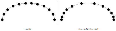
3. The spacing of the ticks in the animation chart below is for an object bouncing with linear speed over 12 frames – draw a similar chart, but with ease-in and ease-out.
Ease in and ease out basically describes the speed of the object when they are travelling between two extremes/poses.
If the object travels at the same speed throughout, it will make the animation look boring, and in some cases, will make it look unnatural and lack of gravity. However, with easing-in and easing-out, the object would first move from point A very slowly out, before accelerating to normal speed. When it is about to reach point B, it will start to slow down and eventually stop at point B. Thus the speed is no longer constant, which makes its movement more interesting to watch.
2. What does frames-per-second means?
Frame is a unit in animation. One frame consists of one image. Frames per second (or fps) simply means that number of images that are shown within a second. It works exactly the same as flip books. The number of pages flipped per second would be the same as frames per second.
Our default fps for films is usually 24 fps, which means that within one second, the films will be transitioning between 24 pictures. Our eyes cannot see the transition taking place around this rate, so this rate is good for us to do animations.
3. The spacing of the ticks in the animation chart below is for an object bouncing with linear speed over 12 frames – draw a similar chart, but with ease-in and ease-out.

Animations in Pencil
After taking the real-life footage and giving it analysis and observations, it is time to put what we have learnt into 2D drawings!
For this lab, we used Pencil to do our animation, as it features a timeline that allows us to draw different frames of the animations.
Ball Bouncing
First, we drew out the path of the ball that it will be travelling.

The red circle in the picture above are the extremes/poses of our animation. They are not part of the path. We started drawing the ball by creating key frames for the extremes. This results in making it look like the ball teleported from the top to the bottom and bottom to top and etc, but at least it is finally showing movement!
To avoid making it look like it is teleporting, we have to draw frames in between the keyframes.

Now the ball is finally look like it is moving along the path. What is left to do was to adjust the spacing of the ball between frames, and correct the timing between frames, so that the ball is falling and bouncing at the correct speed.
Weed Swaying
Drawing the weed was same as drawing the ball bouncing, except that this time we have to take into consideration the fact that different parts of the weed moves differently, and changes direction at different time from other parts. So the bottom part of the weed may be starting to sway to the left, but the top part is still moving to the right. Therefore, we have to take note of the different speed of different parts and draw accordingly.
Final Animation
12 Basic Principles of Animation
In this lab, we were introduced to the 12 basic principles of animation. In order to study animation more deeply, we acted out a few actions that contains one or more of the 12 basic principles of animation that are worth giving a close study and observation.
The video below outlines the 12 principles:
The video below outlines the 12 principles:
Wednesday, June 29, 2011
Notes 05
Animation in Maya
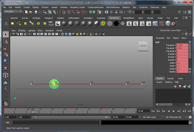
"S" key: create Keyframe
Animate -> Create Motion Trail: Maya will draw out the path of the animation, allowing us to see how it moves.
Animate -> Create Motion Trail: Maya will draw out the path of the animation, allowing us to see how it moves.
Hit "S" to create a key frame for that particular position.
Basic:
Just move the object (using one orthographic view is the best way) using the move tool. Then press the S key to create a key frame. If there are normal frames between two key frames (2-6), then Maya will move smoothly in a straight line from the position in the first keyframe to the position in the next keyframe.
However, sometimes not all object moves in such a straight line. In order to do our bouncing ball for example, we will have to create mutiple keyframes and manually position the object outselves in each frame. While easy to do and effective for simple objects, sometimes when it gets pretty complex, the amount of keyframes that we have can be so confusing and messy till it blows people's mind away. Therefore, we can use the advanced method instead.
Advanced:
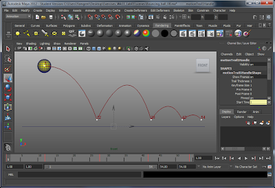
Use graph editor to edit each individual attribute using a graph. The x-axis is the keyframe number while the y-axis is the value for the attribute. From here we can control the attributes individually with powerful features. We are no longer constrainted by a single straight line. We are able to use curves to smoothen and speed up/slow down at different parts of the time which makes the animation a whole lot better, and at the same time not needing so much keyframes to make the thing move.
Saturday, June 11, 2011
Assignment 1: Self Critique


(click pictures to see the enlarged version)
Some parts of the shape of the clock was a bit off if you compare the original real-world clock with the one I did in Maya. The circular shape for the LED screen was a bit too big. The back side of the clock is actually slanted, but my model in Maya looks pretty straight. The clock in the real world was also slightly fatter in depth and looks less round than in Maya. The model is okay otherwise, and in fact I liked how it turned out.
For the texturing, I am glad that most of the things went out fine. However, the text and the numbers on the LED screen was a bit slanted, which I had tried to fix it by trying to rotate the uv-map but it still looks slightly slanted (the original uv-map was worse, the numbers were extremely off without rotating the uv-map).

(click picture to see the enlarged version)
Also, for the sliders part, I felt that I should not use bump mapping for the spaces that the slider can move on, and doing a Boolean difference would be a possible alternative instead. This took some time to make it look right because the positions of the sliders were not indicated on the snapshot of the exported uv-map, so it take some time to draw the "pushed in" space for the slider and even then the space doesn't look straight enough.

(click picture to see the enlarged version)
Tuesday, June 7, 2011
Bumpyness & Giving It a Smooth and Natural Look
Step 5.2: Putting In Some Bump Maps
Now that we have some textures up, the final thing for getting the bonus is to put up some bump maps!
First... let us talk about the bump mapping techniques. What is bump mapping? It allows us to use lighting to create the details for the object. For example, bump mapping allows us to make a polygon looks like it has a lot of details, even though we only have one flat polygon down there. This is possible as the computer can use the bump map to cast different amount of lighting to different areas of the polygon. This gives the illusion that the thing is "bumpy" and detailed. The picture below shows bump mapping.

So how does it work? It is actually using another image to determine how much light to cast onto different areas of the surface. In the example above, the image below was used for the bump map texture.

Basically, the bump map uses different shades of gray to determine the "height" of the area. Completely white is the highest point in the bump map. The more dark the area is, the more "pushed in" it is. So if it is completely black, it is the deepest that the area can be "pushed in".


Thus, there was not a need for me to do Boolean Difference to create the triangle for the battery cover, nor do Boolean Union to create the details for the slider. Saves polygons and also allows me to create and modify details easily instead of manipulating polygons!
Step 6: Smoothing the Object
The final step was to smooth the object. Right now, the clock model has sharp edges, which doesn't look very nice and is certainly not what our real-world object looks like. The sharpness looks too unnatural and therefore we have to find a way to smooth it.
There were two ways of solving this approach, however, picking either one of them has its own advantages and disadvantages. The picture below explains the scenario that I faced:

Eventually, I decided to have it "really" smoothed, because you can only see the bump maps in render mode and not when you draw the model, so I had to make sure that the object is smooth in render mode too. Thus I went ahead and press Mesh > Smooth.
However, this means that the clock now has 6112 polygons. But, I don't think it will matter since I am not using in a real game development project or anything, so this will do for now.
So this is the final product of all the work that I have done. The model for Assignment 1: complete!


Now that we have some textures up, the final thing for getting the bonus is to put up some bump maps!
First... let us talk about the bump mapping techniques. What is bump mapping? It allows us to use lighting to create the details for the object. For example, bump mapping allows us to make a polygon looks like it has a lot of details, even though we only have one flat polygon down there. This is possible as the computer can use the bump map to cast different amount of lighting to different areas of the polygon. This gives the illusion that the thing is "bumpy" and detailed. The picture below shows bump mapping.

(click picture to see the enlarged version)

Basically, the bump map uses different shades of gray to determine the "height" of the area. Completely white is the highest point in the bump map. The more dark the area is, the more "pushed in" it is. So if it is completely black, it is the deepest that the area can be "pushed in".

With the original texture as the base, I modified them to make my bump map for the clock and the sub-components, using the concept described above. Here is some result of creating the bump maps.


(click pictures to see the enlarged version)
Thus, there was not a need for me to do Boolean Difference to create the triangle for the battery cover, nor do Boolean Union to create the details for the slider. Saves polygons and also allows me to create and modify details easily instead of manipulating polygons!
Step 6: Smoothing the Object
The final step was to smooth the object. Right now, the clock model has sharp edges, which doesn't look very nice and is certainly not what our real-world object looks like. The sharpness looks too unnatural and therefore we have to find a way to smooth it.
There were two ways of solving this approach, however, picking either one of them has its own advantages and disadvantages. The picture below explains the scenario that I faced:

(click picture to see the enlarged version)
Eventually, I decided to have it "really" smoothed, because you can only see the bump maps in render mode and not when you draw the model, so I had to make sure that the object is smooth in render mode too. Thus I went ahead and press Mesh > Smooth.
However, this means that the clock now has 6112 polygons. But, I don't think it will matter since I am not using in a real game development project or anything, so this will do for now.
So this is the final product of all the work that I have done. The model for Assignment 1: complete!


(click pictures to see the enlarged version)
Touching Up: Putting Up the Textures
The shape outline is now complete, so what is left was to put up the textures
Step 5.1: Putting Up the Textures
This is perhaps the most tricky part because we only took one week to actually learn how to do texturing in Maya. However, I have read of these before so I am pretty confident in putting up the texture.
The first thing we have to do is to create the uv-map. I used automatic mapping, which is the same tool used during the texture creation for the cube. Although the clock is not a cube, but it has "six sides" like the cube, so it was good enough.

The parts are all over the place. So the first thing was to identify which faces belong to which side of the alarm clock.

Note: I know that the gray area was the only place where you are supposed to put the uv-maps for the faces, but I need some space to organize the faces.
Note 2: Other than the front faces, the faces for the other sides turned out to be alright and are together.
So I am left with the front faces, which for some reasons, are divided into several fragments.
So before I combine every sides to form one big uv map, I have to fix and combine the front side faces first. I could sew the edges one by one, but it takes quite some time, and the faces will get deformed as I combine more and more edges, which is bad. It also appears that you have to select all the correct edges before sewing, otherwise you will find that some edges are not sewed properly. So even though it looks like it is sewed, there are actually 2 edges.
Eventually, I settled on a method that I have found. I selected all the front faces (which will hide the other side faces in the uv editor), and choose Create UVs > Planar Mapping. I use Z axis for the Project from: settings. This basically lines up and arrange the uv mapping for the faces the same way it will appear as if I look at the front camera (the z axis way) in Maya.

This kept the shape and also keep the faces together. Fragment problem solved!
Next was connecting all the sides so that they eventually form one big uv map. This step is pretty optional, but as I do my texture later, I realized that the battery compartment overlaps into two sides, so I eventually decided to combine everything together.

The uv-map is now complete, and the final uv-map is exported as a snapshot, into an image, which I then use my image editing software to start making my textures.


There were very little issues with the uv-maps of the sub-components (i.e. the hr/min button, the snooze button and the sliders), because they were pretty simple objects and requires little modification. In fact, the hr/min button requires no modification to the uv-map because the default one was fine.

The last thing to worry about is the materials that are used for the clock. The clock reflects some light, so it won't really make sense to put everything in lambert. I created new blinn materials and put it onto the buttons and the clock itself.
For the LED display, there was slightly more light reflecting compared to the other parts of the outer cover of the clock. So it needs to have another material so that the light reflection can have a different value.
Originally I thought that the object itself can only have one material. But in reality, each individual faces can actually have its own material. The picture below illustrates the point, where I have blinn and lambert materials applied to the same object but to different faces, with different colours.

Using this same method, I manage to make the LED display of the clock more shiny compared to the outer cover of the clock.

The texturing portion is done. Now the next step is to put in some bump mapping.
Step 5.1: Putting Up the Textures
This is perhaps the most tricky part because we only took one week to actually learn how to do texturing in Maya. However, I have read of these before so I am pretty confident in putting up the texture.
The first thing we have to do is to create the uv-map. I used automatic mapping, which is the same tool used during the texture creation for the cube. Although the clock is not a cube, but it has "six sides" like the cube, so it was good enough.

(click picture to see the enlarged version)
The parts are all over the place. So the first thing was to identify which faces belong to which side of the alarm clock.

(click picture to see the enlarged version)
Note: I know that the gray area was the only place where you are supposed to put the uv-maps for the faces, but I need some space to organize the faces.
Note 2: Other than the front faces, the faces for the other sides turned out to be alright and are together.
So I am left with the front faces, which for some reasons, are divided into several fragments.
So before I combine every sides to form one big uv map, I have to fix and combine the front side faces first. I could sew the edges one by one, but it takes quite some time, and the faces will get deformed as I combine more and more edges, which is bad. It also appears that you have to select all the correct edges before sewing, otherwise you will find that some edges are not sewed properly. So even though it looks like it is sewed, there are actually 2 edges.
Eventually, I settled on a method that I have found. I selected all the front faces (which will hide the other side faces in the uv editor), and choose Create UVs > Planar Mapping. I use Z axis for the Project from: settings. This basically lines up and arrange the uv mapping for the faces the same way it will appear as if I look at the front camera (the z axis way) in Maya.

(click picture to see the enlarged version)
This kept the shape and also keep the faces together. Fragment problem solved!
Next was connecting all the sides so that they eventually form one big uv map. This step is pretty optional, but as I do my texture later, I realized that the battery compartment overlaps into two sides, so I eventually decided to combine everything together.

In the process of combining the edges!
(click picture to see the enlarged version)
The uv-map is now complete, and the final uv-map is exported as a snapshot, into an image, which I then use my image editing software to start making my textures.


(click pictures to see the enlarged version)

(click picture to see the enlarged version)
The last thing to worry about is the materials that are used for the clock. The clock reflects some light, so it won't really make sense to put everything in lambert. I created new blinn materials and put it onto the buttons and the clock itself.
For the LED display, there was slightly more light reflecting compared to the other parts of the outer cover of the clock. So it needs to have another material so that the light reflection can have a different value.
Originally I thought that the object itself can only have one material. But in reality, each individual faces can actually have its own material. The picture below illustrates the point, where I have blinn and lambert materials applied to the same object but to different faces, with different colours.

(click picture to see the enlarged version)
Using this same method, I manage to make the LED display of the clock more shiny compared to the outer cover of the clock.

The LED screen is now more shiny!
(click picture to see the enlarged version)
The texturing portion is done. Now the next step is to put in some bump mapping.
Saturday, June 4, 2011
Adding Our Sub-Components
So... we have our enhanced shape for our outer shell of the clock... but we are missing the buttons and sliders!
Step 3: Adding Our Sub-Components
Snooze/Light Button
The original plan for it is to use the Mesh > Create Polygon Tool, then trace out the outline of the Snooze/Light button, and at the end extrude the face so that it is not as thin as a paper and has actually some depth.

There is a problem with this approach as I discover later. The polygon is not made up of quads or triangle, but rather, is made up of one n-sided polygon! While this may seems minor, later I decided to bent the button to match to the shape of the clock.

But the bending is difficult to do because the polygons would then became deformed and the shape screws up.

The solution was to redo the button, but this time, instead of using the Create Polygon Tool, I would just use a rectangular block with several subdivisions, and move the vertices around to make the same shape out. Now this time it is made up of several quads, instead of being made up of only one polygon.


The left side is the new one that is made up of several quads instead of just one piece of polygon on the right side. The right side is the old one that was originally made using Create Polygon Tool.
Now when we bend the button... it bends properly and smoothly without any screwed up shapes.

Hr/Min Button
The Hr/Min button was simply created with a sphere.

Sliders
The sliders were simply created with cylinders.

Earlier on in the plan, I have stated that I planned to create the slider by making two sphere along with the cylinder and Boolean Union them. However, there might be some issues in terms of topology with that method, and because I would like to use bump mapping instead to show that little detail on our slider, the spheres were omitted and only the cylinder was used.
With the sub-components created as specified in the plans, we finally have our complete shape of the clock. What is left to be done is in Step 4 and Step 5, which is to smooth the object and also create some textures (and bump maps) for the clock.

Step 3: Adding Our Sub-Components
Snooze/Light Button
The original plan for it is to use the Mesh > Create Polygon Tool, then trace out the outline of the Snooze/Light button, and at the end extrude the face so that it is not as thin as a paper and has actually some depth.

(click picture to see the enlarged version)
There is a problem with this approach as I discover later. The polygon is not made up of quads or triangle, but rather, is made up of one n-sided polygon! While this may seems minor, later I decided to bent the button to match to the shape of the clock.

But the bending is difficult to do because the polygons would then became deformed and the shape screws up.

The solution was to redo the button, but this time, instead of using the Create Polygon Tool, I would just use a rectangular block with several subdivisions, and move the vertices around to make the same shape out. Now this time it is made up of several quads, instead of being made up of only one polygon.


The left side is the new one that is made up of several quads instead of just one piece of polygon on the right side. The right side is the old one that was originally made using Create Polygon Tool.
Now when we bend the button... it bends properly and smoothly without any screwed up shapes.

Hr/Min Button
The Hr/Min button was simply created with a sphere.

(click picture to see the enlarged version)
Sliders
The sliders were simply created with cylinders.

(click picture to see the enlarged version)
Earlier on in the plan, I have stated that I planned to create the slider by making two sphere along with the cylinder and Boolean Union them. However, there might be some issues in terms of topology with that method, and because I would like to use bump mapping instead to show that little detail on our slider, the spheres were omitted and only the cylinder was used.
With the sub-components created as specified in the plans, we finally have our complete shape of the clock. What is left to be done is in Step 4 and Step 5, which is to smooth the object and also create some textures (and bump maps) for the clock.

(click picture to see the enlarged version)
Subscribe to:
Comments (Atom)