Tuesday, May 31, 2011

Expanding Off Our Details for Assignment 1

I left off with just having the clock's outline modeled out, thus only finishing Step 1 of our entire project. Now, I will continue with Step 2, which is to start working with the details of the clock.

Step 2: Adding the Details In
One of the way that I am going to create the details is to use boolean differences. For instance, the front of the clock has a "pushed-in" circular shape at the front of the clock for the screen. To get that appearance, I am going to use a cylinder, and use that to boolean difference with the clock.

(click picture to see the enlarged version)

After doing Boolean Difference... we get this:

(click picture to see the enlarged version)

One of the interesting issue of the Boolean Difference is that it is not "clean". I end up getting polygons that are not quads or triangles, which is bad.

Polygons with more than 4 sides = bad

Unfortunately, it seems that boolean differences is the best, easiest (and perhaps, the only viable) way to get my circular shape. So I have to do the manual cleanup.

Polygons fixed!

How did I do the manual cleanup?
- Delete any unwanted edges by selecting the edge to delete and going to Edit Mesh > Delete Edge/Vertex.
- Merge two vertices together using the Merge Vertex Tool. I will just have to drag the first vertex to the second vertex.
- Using two vertices to add a new edge. By using the Interactive Split Tool, I can select the first vertex, then the second vertex to connect the two vertices together. Then I press Enter key to create an edge.

(There were other tools, such as Cut Faces Tool, but they either are complex or create extra vertices and I have to use Merge Vertex Tool to merge them back after creating an edge. However, the Interactive Split Tool is rather clean, and won't create extra vertices and is easy to use.)

The process was repeated to create the rectangle for the digital display. Boolean Difference was used again with a rectangle this time, and the cleanup was done so that we don't get n-gons and introduce problems.

(click picture to see the enlarged version)

And now for the hr/min button area. It took some time to find the correct shape to make that area, because it doesn't really seems to look close to a shape. In the end, I decided that a squashed sphere should do the trick. The same steps apply.

(click picture to see the enlarged version)

(click picture to see the enlarged version)

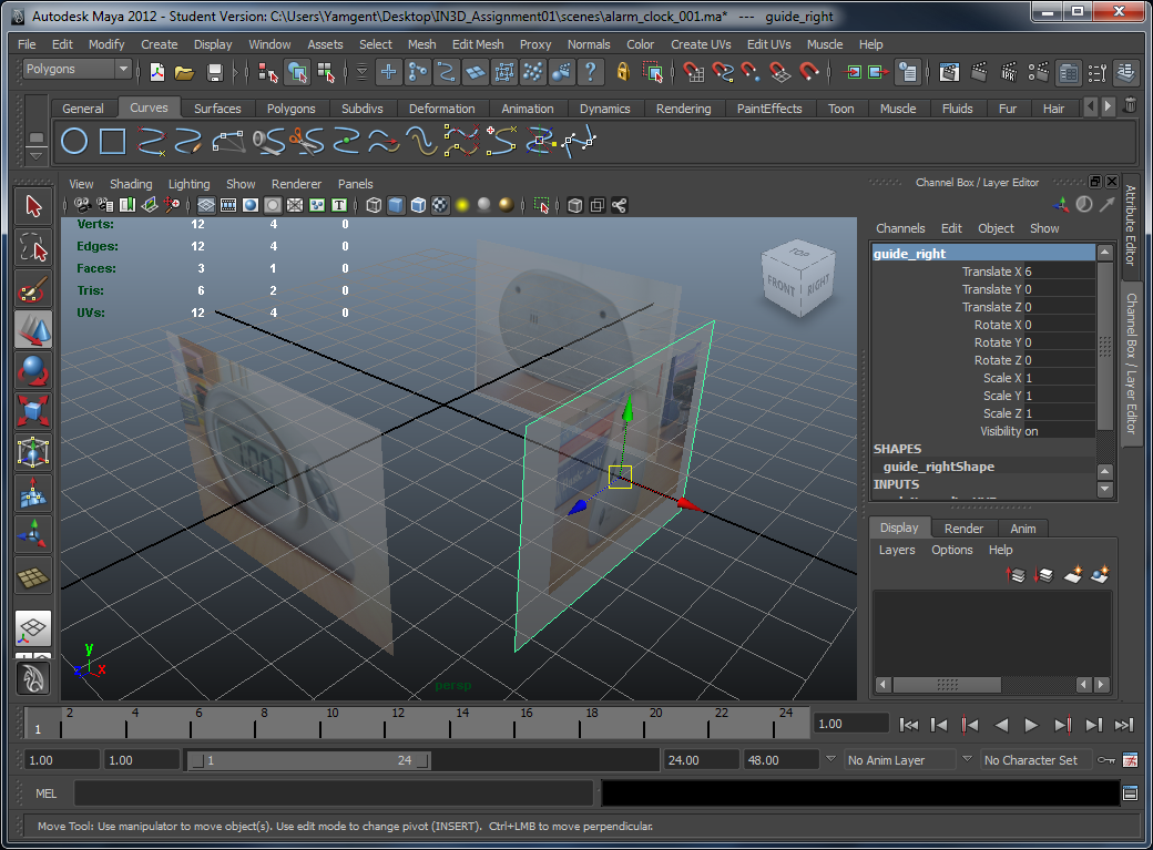
While working through the thing, I realized that my model's shape is getting out of shape when I compared it with the image guides that I put on the flat polygons. I believe that it is inevitable that it will eventually happen, because the images taken are not orthographic. For example, the top image guide is not "strictly" a top view of the clock in Maya. However, it is still useful for me as a way to check whether I am going on the right track. Sure it doesn't fit in exactly, but at least it still must look like the alarm clock that I am modelling.

By doing Boolean Differences with 3 different shapes, Step 2 is completed.

But wait, what about the other details, such as the triangle found on the cover of the battery compartment, that I have described in my plans for Step 2? I decided eventually that I will use bump mapping, which will achieve the same effect that I want, instead of actually using Boolean Difference and add more polygons into my object. So, I will deal with these small details later when we do texturing and bump mappings.

Reflection
This portion of the assignment again took some time to work on. However, I learnt about using the different tools that I can use to improve the topology of my model. By manipulating the edges, deleting or adding edges, I was able to ensure that polygons are either quads, or in worse case, triangles, and there are no polygons with more than 4 sides, making it also more easier for the graphics card to render.

Even though the manual cleanup took a lot of effort to do, it was fun using those tools, and what makes today's work even more interesting is the fact that the details are starting to show up, thus the model is taking shape and it is looking more like our alarm clock now.

Saturday, May 28, 2011

Putting Textures into The Models

Earlier on we created models such as the cardboard and the bucket. I merely put coloured lambert materials onto them and call it a day. This time the models will be painted in wood, granite, and other awesome textures.

Process
It was just a simple and similar procedures for all of the models. Firstly, a new material is assigned to the models, and then we tweak the material's properties. We will also connect the materials to texture nodes such as wood, granite or even use some of the image files provided. That was all it was required to apply some nice textures down, so this exercise was pretty simple.


(click pictures to see the enlarged version)

Compared to my old version of the cardboard, this textured version looks more shiny because I used blinn instead of lambert. Other than that, I really don't see a big difference...

(click picture to see the enlarged version)

For the bucket, besides applying the ramp texture, we also need to tweak the UV mapping of the cylinder because the texture right now is wrapping around the edges of all the faces, instead of flowing smoothly from top to bottom. We used cylinder mapping because it fits most closely to our bucket mesh.

(click picture to see the enlarged version)
Without using cylinder mapping. The texture is applied individually to each faces.

(click picture to see the enlarged version)
Using cylinder mapping allows our texture to map correctly on the bucket.

For the track, we not only use the Ramp texture, we went further and add the noise texture on top of it, so that it will make the track look older.

(click picture to see the enlarged version)
Before adding Noise

(click picture to see the enlarged version)
After adding Noise

The washboard's wood was the same as what was done for the blocks previously... except that the glass for the washboard had bump mapping applied to it.

One thing that was kind of bothering me was the jagged edges that I see on both the perspective view and the rendering. Tried tweaking various properties in the rendering settings, but it seems that there's still no anti-aliasing applied. Went to search in the internet for some tips but they turn out not working either.

In the end, I decided to just render an extremely big picture, then I resize it to a smaller resolution (this is actually the method that graphics programmers use to implement multisample anti-aliasing in their 3d programs). The image below was originally at 1920 by 1080, something that was so big that my screen can't even show the whole thing, then I resize the window to make it smaller, and tada, no more jagged edges:

(click picture to see the enlarged version)

Reflection
These short tutorials were relatively easy to do,  but they have shown several ways of using built-in textures provided by Maya such as Wood and Ramp texture, which I thought it was rather creative. I think I still prefer just applying an external image file as a texture for my Assignment's 1 clock model though, because I think that would be much more easier, and the words on the clock cannot be created using Maya's built-in textures.

Friday, May 27, 2011

The Journey to Texturing...

For this week, we are finally beginning to do some proper texturing!

The first thing that was introduced to us was the hypershade window, which is an important window for us to manage our materials. We also learnt about connecting nodes, which can be quite useful. For example, we can use the window to basically connect a texture node to a material node, so that all the objects using that material would have the new texture applied.

We have already learnt about materials before, and we have also used textures, which serves as a guide, in order to draw our curve profile in previous labs as well. Therefore, making this sphere, which just require us to create a new material and apply a favourite texture of ours, wasn't really too difficult.

(click picture to see the enlarged version)

Next was the dice texturing. I find this video tutorial rather useful because I would most likely be using this technique for my Assignment 1. Basically, what happens is that in order to put texture onto our 3D object, we have to "open up" the faces and place them on a flat 2d surface. This is known as UV mapping. We can then use photoshop or other image editor to make our texture that accommodates to the UV map so that the texture shows up properly for each faces.

Other video tutorials use built-in textures that are provided by Maya instead of using external image files, which I don't think I will use them for my alarm clock because the built-in textures doesn't have the image that I want for my clock.

(click picture to see the enlarged version)

The final video tutorial was to make a chrome sphere. This is where the built-in ramp texture is used in order to create the "chrome effect" on our sphere. The video tutorial also taught us about using point light and ambient light in order to lit up the scene when we render it.


(click pictures to see the enlarged version)

Wednesday, May 25, 2011

Notes 04

Cleaning Up the Objects - Doing It Manually
Method 01: Boolean a Sphere and a Cylinder

Problems:
- Might end up generating more unnecessary vertices, edges, and even polygons.
- Boolean might not get us the desired result especially if the model is too complex.
- Upon zooming in, we can actually see that the sphere does not flow smoothly down to the cylinder.

Solution: Method 02: Doing the Combination Manually.
- Allow us to reduce the possibility of having extra vertices, edges and polygons, by doing the combining ourselves - more in control.
- Get the desired result.

Steps:
1. Create the sphere and the cylinder as usual.
2. Remove the bottom faces (portion) of the sphere. Also remove the top faces of the cylinder, since we are not going to see the top faces after combining the object (saves polygon!)


3. Move the sphere close to the connecting points.
4. Go to Mesh -> Combine so that we can manipulate the two objects together with the same mode (e.g. Vertex mode)
4. Go to Vertex mode and connect the two pairing vertices, by using the Edit Mesh -> Merge to Center tool.

Before
After

Reading the Poly Count GUI

Left: Total in the entire scene.
Middle: Total in the object that was partially/totally selected
Right: Total in the selection itself.

Repeating the Same Operation Again
'g' Key - Repeat Last Command

Sunday, May 22, 2011

A journey of a thousand miles begins with a single step...

Today, I decided to start work on my alarm clock model, by completing Step 1 of my so-called "war plan".

Step 1: Creating the Cube's Outline
Before I even begin to create anything, I decided that it is important to have my photos of the different views of the alarm clock to be imported into Maya first. Since this is the first time where there's no instructions telling you to set width to 13, set height to 5 and etc., I thought it will be kind of important to use the photos as a guide for my modelling. With the guide, I will roughly know how the model looks like from different sides of the alarm clock, and also not end up making the model appear out of scale and disproportional.

In order to create the guide, I first created polygon planes for each side of the view. After that, I created a new material for each individual plane, so that through the material, I can apply each of the images onto the planes as textures.

Since these planes serve only as a guide, I don't want them to obstruct my view, thus I enabled transparency so that I can see my model when I am modelling.


(click pictures to see the enlarged version)

After I have my images up, it is time to create the cube!

First I created a default polygon cube onto the origin. Then I resized the cube so that it fits to the images.

However, I notice one interesting problem when I resized the cube. Each individual images are taken from different angles and different distances from the camera, so the image of the clock from one of the view may end up being smaller than from another view! Therefore, I fixed them by scaling the images individually so that all the images display a consistent size of the clock regardless of which image I looked.

After the resizing was completed, I played around with the cube's subdivision. I am not sure how much subdivisions I will need, but I eventually settled for this:

(click picture to see the enlarged version)

With the subdivisions in place, it is finally the time to move the vertices of the cube so that they matched the outline of my alarm clock. I took some time to do this but I eventually got the shape right. This is how the shape looks like in the front orthographic view:

(click picture to see the enlarged version)

And at the end of the day, after several moving and adjustment, this was how the was-once-cube look like:

(click picture to see the enlarged version)

(If you have realized, I have moved the image guides around the place. I needed to select the alarm clock outline, and sometimes the guides just get in the way, so I have no choice but to move them. Thankfully, orthographic views don't take into account depth, so the guides appears to remain at the same position even when I move them depth-wise.)

When I got this final result, Step 1 was finally completed. I saved the model and called it a day.

Reflection
Despite the fact that it sounds so simple on paper, this step actually took 2 hours to complete, which I was very very surprised! Maybe that was because most of the time was spent moving the vertices around. I find it rather difficult to adjust them because it always never turn out to what I wanted, so I keep trying and all, but I eventually settled on the one shown above.

In my opinion it still wasn't perfect. However, I managed to convince myself that this was the best one by far by applying the Smooth tool onto it. Yes, I am supposed to use the Smooth tool at a later Step, yet it was kind of hard to know whether this will turn out fine or not in the end so I have to try the tool once anyway.

In fact, I like the outline that have the Smooth tool applied I wondered whether I should bring forward the step for applying smoothness to the object or leave it to a later stage. Oh well, have to make a decision before I continue the next step next time.

I stopped right after Step 1 in order to continue my other assignments and work.

Friday, May 20, 2011

Assignment 1: Shape

I realized that writing this section of the assignment actually requires one to imagine and think inside our brain (without actually doing it in Maya) the process of the creation of our model, in order to get our final product: the alarm clock.

So without further ado... I introduce the war plan for the modelling of the alarm clock.

War Plan: Proposed Steps to Create the Alarm Clock

Step 1: Firstly, create a cube with several subdivision (depend on how detailed we want). Then move the vertices of the cube in order to match our outline of the clock.

(click picture to see the enlarged version)

Step 2: Start creating some other primitive shapes so that we can use them for boolean operations to make it more detailed. What areas are those? In our first example, the screen where the time is shown (see picture below) could use some boolean differences to get created.

(click picture to see the enlarged version)

(con't from step 2) Another example would be the triangle that can be found on the cover of the battery compartment.

(click picture to see the enlarged version)

(con't from step 2) So basically we do boolean operations on various places of our clock. Other areas include the area where the "Hr/Min" button resides, the right side of the clock to make some holes where the sliders are located, and the back where there are holes for the nails and 3 little rectangle holes. Note: we do not create the sub-components for the clock at step 2.

Step 3: After all is done, we start to create our sub-components. The sub-components that needs to be created are the sliders, snooze/light button, and the hr/min button.

(click pictures to see the enlarged version)

Step 4: Use the Smooth and Bevel tools where appropriate so as to smooth out the clock.

Step 5: Put some colours for the clock model. Alternatively, if time permits, I should try doing some texture mapping for the model.

Reflection
After doing all the drawings and thinking about the process, I am more prepared to create the clock in Maya. This will be the first time where I create a model without really following any instructions, so I hope that it will turn out nicely.

I will start modelling the clock as soon as I can.

Assignment 1: Design

Now it is time to do some sketching for my clock model! I have posted not only my own sketches, but also the original images of the clock. Check it out.

Note: Click on the pictures to see the enlarged version.

The Clock Itself
The clock outline shape looks complex, but it can actually be attained by using a sub-division cuboid and moving the vertices around to get our final outline shape. Other details of the clock, such as the screen showing the time, can simply be obtained by using boolean differences. The Bevel tool and Smooth tool will also be used to smooth out any edges and the object in general, since the clock looks rather round in appearance.


Originally, I decided not to do the left view of the clock, simply because most of the details of the left view are already represented in other views, and it was kind of hard to draw out the clock on the left view. Eventually, I feel that it is important to have all the views anyway (who knows I might need it in the future), so I drew it out in the end.


Looks kind of ugly compared to other views though, but I tried my best and this was the best attempt at it.

Sub-components
The slider was pretty easy to draw out. It is just basically an oval-shaped cylinder with two spheres on the top of the slider.

For the snooze/light button, since this face is pretty much weirdly shaped, I might end up using the Create Polygon tool to create it in Maya instead.

Finally, the hr/min button is just a capsule split into two, so that's pretty easy to create in Maya too.

For these sub-components, they will be separate objects with the clock. Of course, they will still be parented to the clock, but these objects themselves should be able to be moved in/out/up/down without having the whole clock move with it, thus the reason for separating them with the clock.


Assignment 1: Story

The object that I wanted to model for Assignment 1 is an alarm clock. Below is the story for the Assignment 1.

Rat and his friend, Lat, like to race on the race track using mousetrap cars. However, one day, Rat started boosting about always winning in all the races that they compete and soon became arrogant about it.

Lat was increasingly furious day by day, and one day he finally said, "Don't be so arrogant! My friend Zat is way better off than you! He will probably finish the entire race in one minute!"

Rat replied, "No worries, go and tell him that I want to challenge him to a race next week."

And so Rat started training to prepare for the challenge. However, there was no way to keep track of the timing, so he had to modify an alarm clock that originally shows the time of the day, to take his timing for the race instead. He originally took around two minutes to complete the race, but after several practices and discovering some techniques, he was soon able to reduce his timing to around fourty-five seconds.

Then the day of the challenge came. Rat and Zat was at the starting point of the racing track. Lat, being the judge of the race, put his hand on one of the buttons of the clock that starts the timing of the clock. Lat shouted, "Ready! On your mark! GO!"

The race was fast and furious as both Rat and Zat overtook each other. But after several seconds, Zat was finally leading and Rat could not manage to catch up with him after that. Zat went on to hit the wire at the finishing line, which stopped the clock's timing, and completed the race in merely thirty seconds.

When Rat debarked from his car, he could not believe his eyes when he looked at the clock. Zat's timing was way too good! Rat finally realised that his skills were nothing compared to Zat, and congratulated Zat for winning the race.

After the challenge, Rat went on to apologize to his friend Lat. "Sorry, I was being too arrogant," Rat said to Lat. "No worries Rat! I hope that you finally realise that when you thought that you are really very good, always remember that there will be someone better than you!" replied Lat.

And they remained as best friends forever for the rest of their life.

Tuesday, May 17, 2011

Thinking Outside the Traditional 3D Mindset readup for Week 4

  • Does multi-tasking give you a real or false sense of having accomplished something?
It gives me a false sense of having accomplished something. People who end up multi-tasking will indeed feel that the tasks are going towards completion, since they will always constantly monitor the progress of all the tasks that they are doing. However, like the article states, having that feeling does not always mean that time is efficiently used, and in fact, multi-tasking leads to poorer efficiency.

In contrast, people who single-task feels that they are slower, but that's because they are only constantly monitor the progress of one of the tasks (which is the current task that they are doing). Therefore, people have a wrong perception of multi-tasking because of these illusions that make multi-tasking shine in a good light, when in reality, it is actually more harmful than single-tasking.

Multi-tasking is for computers, where they only incur a little expense of time to switch between tasks. In fact, with modern technology, the time incurred becomes so small it becomes negligible. However, our human brain is not "engineered" to do multi-tasking, which is why multi-tasking can end up wasting more time instead of making us more efficient, because switching between tasks will temporary confuse our brain and it also takes time for the brain to adapt and work on the new task.


  • Is learning 3D and design different from learning programming, or is all learning the same? Why?
Learning 3D and design and learning programming is slightly different because they focus on different skills that are needed. Programming requires more of thinking and logical skills, thus it is slightly more taxing to the brain than doing 3D and design.

However, at the end of the day, both still requires a lot of attention and a lot of time. Just like there's no free food in the world, there's no learning miracle in the world either. Unless a person's IQ is really high, we will be subjected to the fact that our brain needs to take time to absorb information, and our brain can also sometimes forget them too if we do not repeatedly reinforce the information into our brain.


  • The article states that "Learning is actually a very complex operation for an individual". Do you agree with this? Do you feel that you approach your learning style in the best way - if yes, how, and if no, how can you change your work style?
Yes, I agree that learning can be very complex, because it requires a person to use a lot of attention and focus. You need your eyes to read and observe, but we can only read one thing at a time. You also need your brain to process information and perhaps use your logical part of the brain, but our brain has limited memory capacity and working power at a time. For learning alone, our brain have to manage our senses properly so that as much information is absorbed as possible, so our brain definitely do not have a space left for other tasks.

I think that I have not approached my learning style in the best way, because I get distracted very easily and thus ending up impeding the progress of my other tasks, especially those that are important. Removing or distancing myself away from the distractions would probably make my learning better.


  • What are your thoughts about the last paragraph in the extract?
I think that the last paragraph of the extract is speaking the truth. Our society today is getting more and more individualism. Yet going in that direction does not generate any benefit to the company or to other colleagues, because eventually, the product has to be sold and the company has to hope that their customers will like it. In other words, we are doing the work not for ourselves alone, but also for other people.

If there is a lack of cooperation, then it will be very obvious to an outsider, because each part of the product will look different from other parts of the product and the uniformly of the entire product will disappear.

For example, lets say that a team of 4 people have to draw an image of a human. If it was done on paper, like in the past, people will have no choice but to work together on the single piece of paper. Nowadays, we have tools such as Photoshop that allows us to combine each and every individual's work together to produce a final product. So perhaps in an individualism scenario, we assign each people in the team to draw different parts of the human. 1 will draw the arms and the hands, 1 will draw the legs, 1 will draw the head, and 1 draws the chest area. If there is a lack of communication between the team, then when we combine everyone's work into Photoshop, we will end up having a monster, not a human. This is the reason why the uniformly of the product disappears, if there is a lack of cooperation within the team.

In the above example we also see a lack in a uniform direction. Everyone draws whatever style that they like. However, even with a uniform direction, the client that are buying the product may not like how it turns out. Thus, communicating with the client is also a critical skill, because otherwise you will end up being the only one who enjoys the product, not the customers. And we have to depend on customers to get our profits.


  • Should your lecturers also focus on your work attitude, or just leave you to sink or swim on your own? Why?
I think that at the end of the day, we are the only one responsible for our work attitude. Our lecturers do not need to focus on our work attitude, because naturally, they already have. Lousy work attitude will produce lousy work, so the results will already have partially reflect the work attitude that you have. The result is the best way to tell a student to buck up and correct their work attitude. Therefore I think the lecturers do not need do anything more than that to focus on our work attitude. No matter how much the lecturers do, the matter of correctly our work attitude is eventually decided by us. If we will change it, we will, if not, then nothing else can really do any impact or changes.

Saturday, May 14, 2011

Notes 03

When moving stuff...
  • Hold 'X' key to snap to grid.
  • Hold 'V' key to snap to vertices.
Useful Mesh Tools
  • Edit Mesh -> Merge (merge the vertices together so it becomes only one vertex)
  • Mesh -> Create Polygon Tool (place vertices to create a polygon)
  • Edit Mesh -> Split Polygon Tool (cut a face into one or more division)
  • Edit Mesh -> Insert Edge Loop Tool (cut multiple faces of an object in a loop into one or more divisions)
Extrusion Trick
  • To use curve as a path for extrusion, open the Extrude options (Extrude []).
  • Tick the check-box 'Use selected curve for extrusion'.
  • Taper: close up the end. 0 - closed up, 1 - no close up/taper.
Using Lambert to Colour our Models
  • RMB -> Assign New Material -> Lambert
  • Open up attribute editor (use the button at the top right of the Maya window)
  • Under lambert1 (or lambertX, where X is a number), there is an attribute call 'colour'. Press the colour box beside the attribute name to change colour.
  • Alternatively, press the black-and-white checker box, and choose 'File', in order to select a file for texturing.
Polygons in Generals
  • Either use triangles or quads. Don't use polygons that have more than 4 sides, some functions screw up the model in Maya with such polygons.

Friday, May 13, 2011

Do It the Traditional Way

(click picture to see the enlarged version)

The traditional washboard for washing clothes. If there was a television advertisement about this, I think it will feature a bunch of celebrities playing music with it together with a singer.

Process
Firstly, a long flat rectangular cuboid with several subdivisions were made. Then, on the edges of the subdivisions, a bevel was done to make space for the ribs, then I did an Extrude function to push out the faces to make the ribs. To make the ribs smoother, a bevel was also applied on the ribs.

(click picture to see the enlarged version)

The rest of the washboard was pretty simple. I just created a few cuboids, resized them, and moved them next to each other and positioned properly using the Align tool.


Reflection
The Align tool was rather hard to use because sometimes the layouts does not show up, so I cannot press them, regardless of how much I rotate my viewport around. Nevertheless, after a few tries, I was able to get them to show up and positioning all my cuboids.

Otherwise, the tutorial, just like the train track, was rather easy to accomplish, as I have grasped most of the features of Maya taught in the labs. However, right now most of the time it is still following some instructions, so the appearance of the model still looks nice in general. I was kind of afraid that if I start creating my own models, they might look out of scale, disproportional, or just look weird. I might have to put in some pictures using planes inside Maya as a guide if I start creating my own models.

In this lab, I also tried to put in textures instead of just colours for the washboard frame, so the frame now has a woody kind of appearance.

Thursday, May 12, 2011

Train Tracks

(click picture to see the enlarged version)

Trains coming along your way!

Process
As usual, the train track's profile was drawn, but this time, the Create Polygon tool was used instead of the curve so that we immediately start with a polygon once the profile was completed.


Then I did the usual Extrude function... but, this time we not only extrude, the extrusion was set to 20 divisions, so that later we will be able to bend the train track later.

(click picture to see the enlarged version)

Some extrusion was done for the front part of the track so that it looks like it is attachable to any other train tracks.

(click picture to see the enlarged version)

Finally, the bending part was done using a deformer which gives us the final product of our train tracks.

Reflection
This exercise was pretty much easy to do compared to the others, or it might be because I am already used to working with the features in Maya.

I also learnt about using the deformer to bend the track. Without the deformer, one would either have to draw another curve to act as a path for the Extrude function (just like how the bucket's handle was made), or have to move the vertex one by one by ourselves. The first alternative would work but that means that we always have to undo the Extrude function if we want to bend in a different shape or direction, while the second alternative is just a waste of time. Therefore, the deformer is the best in this scenario since it helps us bend the track without any problems stated above.

In this exercise, I have also learnt that it is possible to have multiple divisions while extruding.

Wednesday, May 11, 2011

The Beautiful Vases

(click picture to see the enlarged version)

Above is the vase that looks somewhat similar to the one shown on the lab sheet. For the image below, I tried creating my own version of the vase, and it failed terribly...

(click picture to see the enlarged version)

Process
The steps are similar to the one for creating the bucket's surfaces. The curve profile for the vases were drawn, and then, I used the Revolve function to create the vases.

(click picture to see the enlarged version)

Reflection
Yet another interesting way of using the Revolve function on a curve to create a model!

However, because I didn't use an actual image as a guide for my profile, I didn't get it right straight away after drawing the curve out. I have to use the "Edit Point" and the "Curve Point" features, that can be found in the context menu by right clicking, in order to move some of the points for my curve, and also to add more points to make it look smooth. (I didn't add more points for my interior of the vase, because it is unlikely that someone will look at the interior of the vase, so there isn't a need for so much polygons to be wasted there.)

Therefore, from this exercise, I learnt that it is better to have at least an image for a guide so that I won't end up having to make too much modifications!


EDIT: Okay, so I decided... since this isn't going to be used in applications like games... why not try and use the Smooth function to make it looks even smoother? So the result is... the ultimate frame-rate killer:

(click picture to see the enlarged version)